Thank you and good night! 🙂


Hello and happy new year 2010!
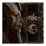
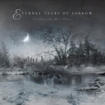
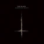
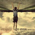
Here goes my first post judging album covers from 2009. This is not supposed to be top albums – it´s just covers. Some of these bands I´ve never even heard of but as we all music lovers know sometimes you pick up an album by it´s cover. Sometimes you don´t buy it – because of it´s cover. Dont you?
I´ve browsed through hundreds of releases from last year and ranked them with following categories:
So here we go, you don´t have to agree with me as we know all these “top 10-something” lists usually get people frustrated.


This is an article written together with fellow Millworker Kimmo from K.K. Downing´s website Steel Mill (www.kkdowning.net)
At least since the 1970s, band logos have been a big part of rock bands’ visual image. Not only to ‘brand the band’ in order to boost the sales of merchandise, but also, especially when we’re talking about heavy metal genre, to provide kind of signs of subculture to the fans -to make the music, and the whole metal culture, present in our everyday life. Many of us could easily remember drawing these logos in school books or on denim jackets, some of us even carving them on school desks… Here we are going to take a look back into the evolution of the Judas Priest logo, from the start in the 1970s to the present.
The first time the name Judas Priest appeared on the racks of record stores was in September 1974, when their debut album ‘Rocka Rolla’ was released. The logo, like the whole ‘bottlecap’ artwork used in the cover, was designed by John Pasche, Gull Record’s graphic designer, who had also made designs for the Rolling Stones earlier in his career. In fact, the ‘bottlecap’ artwork was first intended to be used with the Stones, but it ended up on Priest’s debut. Maybe it was the pop artistic nature of the cover that made John to design a new, better matching logo, instead of the old gothic style one the band had used before. Although this cover won some graphic design awards at the time, it somehow never matched the music on the album. The different logos used in French and German 7 inch single releases underline the fact that this particular logo never really stabilized to represent the nature of Priest’s music.
PETE: Most of the bands use different logo variations in their early days. It’s part of searching and finding an own and unique style. The most important task for a logotype is to reflect the music. Rocka Rolla’s ‘bottle cap’ artwork and logo is cool-looking and represents the era, but it doesn’t say much about the music. This is something where many bands and musicians go wrong. There are not many bands who have kept the same logotype for 30 years or more.


PETE: Sad Wings of Destiny has everything that a good album cover needs: it has a picture which reflects emotions from good to bad. It’s angelic and demonic in every aspect. You can imagine the artwork hanging in an art museum somewhere and people around it are amazed about what they see. It almost speaks to you, especially the LP-version brings the art to life. When you see how the logo and the album title are placed you can’t argue what an excellent piece of work it is. It also has the “Devils Tuning Fork” in it, the symbol that has been Priest’s trademark for many years. These little symbols are just what every band needs, something to help the fans to remember the band visually, something to draw on the paper when there´s nothing else to do. It is extremely important for a band to be remembered also visually. It´s a branding technique which almost never fails.


 If the gothic logo was a great success, the next one was to become a real classic. Based on the futuristic lyrics on Priest’s fourth album, ‘Stained Class’ in 1978, Roslav Szaybo from CBS Records designed a whole graphic concept that went hand in hand with the music. Long gone was the gothic darkness; instead there is a science fiction themed artwork with a new ‘electrified’ Judas Priest logo. This logo remained almost unchanged until the American version of ‘Point Of Entry’ was released in February 1981. The only change it went through was the addition of one extra point in the streamline going below the letter s, shortening the bridge between words ‘Judas’ and ‘Priest’. This change first appeared on the album ‘Killing Machine’, titled as ‘Hell Bent for Leather’ in America. Surprisingly, this revised logo was also printed on the cover of the re-mastered ‘Stained Class’ in 2001, instead of the first version.
PETE: Stained Class album really is a unique piece of art. It is futuristic, evil, demonic and actually quite trendy. It’s the first time the Priest logotype was placed diagonally to the right side of the albumcover. For a graphic designer (who has done like a million bootleg covers for Priest) it’s challenging to place a logo like that on the cover. Stained Class has a bullet flying in it diagonally, so it makes sense to place the logo where it is. Ram it Down was the first album cover where the diagonal line doesn’t suit the main image. All the previous albums (especially Screaming for Vengeance, Defenders of the Faith and Turbo) share the same kind of movement, and the logo is just perfect the way it is. I really wonder about Stained Class whether the main image was designed before the logo or vice versa.
I’ve also always liked the way the album titles are placed in many Priest albums; very simple sans serif typing without any unnecessary effects.

 PETE: Yet again it’s interesting to see how Judas Priest (and so many other bands) keep changing the logotype in their single releases. Looking at Priest´s singles (you can view almost all of them at Steel Mill´s Discography –section) you can see a lot of different designs of the logo, stretched in different sizes horizontally and vertically. Some might say it keeps the logo alive, but personally, I don’t believe these “mutations” keep anything alive. In order to create a ‘band brand’ you must keep the band visually recognisable in any media available. Small adjustments and evolving are always welcome (compare logotypes of Stained Class and British Steel, for example) and that is what keeps the ‘brand’ alive.
 In Europe ‘Point Of Entry’ was still released using Roslav Szaybo’s old logo, but in America Columbia Records, for some reason, wanted to use different graphics. The man called to redesign ‘Point Of Entry’ was John Berg, the art director of Columbia Records. John had earlier worked with artists like Bob Dylan, Bruce Springsteen and Chicago, just to name a few. Despite the fact that during his long career Berg was nominated for Grammy awards various times, this particular artwork couldn’t be counted among his best ones. However, the 3-dimensional effect John added to Roslav’s old logo was excellent, and it appeared on the covers of next 3 albums: from ‘Screaming for Vengeance’ to ‘Turbo’, the period when Doug Johnson was responsible for the artwork.
PETE: Usually I’m not a big fan of 3D graphics but Screaming…, Defenders…, and Turbo with Doug Johnson’s artwork are albums where this style fits perfectly. I’ve always wondered why they needed to change the album cover for Point of Entry. The original might not have been the most ‘metal’ out there, but it did it’s job and it reflects the music well.


The change in the next release, ‘Priest…live!’, was extremely dramatic. A completely new logo was designed by an English graphic designer Richard Evans, best known for his numerous works with the names like Robert Plant, the Who and the Doors. This new distinct logo got the shortest lifespan of all the Priest logos so far: it was used only once. Here, the text was reduced just to plain initials J&P, and according to numerous fans, its abstract artwork came a bit too far the from traditional heavy metal expression that had been a trademark for Judas Priest albums during the past years.
PETE: Priest…live has a really cool artwork, logotype and feeling in it but it is too different from all the other designs and visual elements Priest has had during the years. Personally, I like it a lot and even remember when I bought the LP and opened it. It was just so cool-looking and… I´m using this word again… trendy! For some other band it could give all the elements for the whole visual image.
 Since ‘Ram It Down’ in 1988, Mark Wilkinson, an English freelance illustrator, has been responsible for almost all Judas Priest artwork. The extremely ‘macho’ and ‘metallic’ sleeve of ‘Ram It Down’ was definitely a way back to the classic heavy metal art, and was also a return to the good old Szaybo design. This time the 3-dimensional effect was shortened, and a molten metal effect was added. The molten metal logo appeared unchanged on the cover of 1990 ‘Painkiller’, but when the ‘Metal Works’ compilation album was released in 1993, the 3-dimensional effect was dropped off.
PETE: The visual image of ‘Metal Works’ with its black and white feeling is one of the best in Priest albums. The logotype looks really cool with its metallic shine and the lettering ‘Metal Works 73-93’ around it fits just perfectly making the image look like a stamp or something.
 As the previous three Judas Priest logos (with the exception of ‘Priest…live!’, of course) had been based on Roslav Szaybo’s original idea, the era between ‘Jugulator’ and ‘Live in London’, from 1997 up to 2003, got a totally different logo decorating the sleeves of Judas Priest releases. Mark Wilkinson was still the man behind the artwork, and although there are some elements left from the old Szaybo logo, this new one was different enough to underline the line-up changes Priest had recently gone through. In fact, this ‘Ripper era logo’ has two variations. ‘Jugulator’ and ‘Live Meltdown’ had the words ‘Judas’ and ‘Priest’ placed vertically, with a design that could be seen as a part of the famous ‘Judas Priest cross’ or ‘Devil’s Tuning Fork’ placed in between. The latter two albums, ‘Demolition’ and ‘Live in London’ were without the cross and the words were now levelled horizontally.
PETE: Sometimes I’ve wondered what I would do if I had to design the Priest logo all over again with the respect of the visual legacy Priest has. I’ve come up with ideas similar to with Demolition has. I like it with its harmonic and pleasing feeling. The logotype on ‘Jugulator’ is also cool-looking. It has this diagonal thing along with brand new Priest fork. The good old ‘Devil’s Tuning Fork’ is a brand itself, and very unique, but there’s nothing wrong with the fork on these two albums. The ‘axe’ look in it gives a sharp feeling of a brutal metal band. The word ‘brutal’ also reflects well f these two albums, especially Jug.
Brand-wise, its a sticky situation for a band to come up with a new singer, a new kind of music and still try to keep the legacy alive and well. It is also challenging concerning the visual image of a band, and I believe Priest a did pretty good job with their logo changes.
 Along with the reunion of the band in summer 2003 came the classic Roslav Szaybo’s design from 1978 back to service, as it was used on the cover of the retrospective ‘Electric Eye’ dvd. The latest update of the Judas Priest logo got its world premiere on the 2nd of June 2004 in Hannover, as it appeared on the band’s stage backdrop, during ‘United’, at the end of the show. Here the ‘Judas Priest cross’, which during the past years had also become a very important part of the band’s visual image, replaces the letter t from the classic logo. So here they are now, also united, the two perhaps the most well known visual elements ever appeared on the covers of the Judas Priest albums.
PETE: It’s really an ‘obvious’ choice to create a logo with the ‘Devil’s Tuning Fork’ sticking out from it. It fits well and stands out. It might make the text look a bit too ‘tight’, a more open lettering would help a lot, but joining these two classic elements enhances the logotype a lot. I’m really waiting for the Nostradamus album as well as the logo evolvement of the future albums of the greatest metal band ever.


Rocka Rolla:
Cool idea and nice design but not the best concept for hard rock music.
![]()

Sad Wings of Destiny:
Ultimate piece of art. This is what heavy metal is all about: the battle between heaven and hell. Judas Priest brings it all with Sad Wings of Destiny.
![]()

Sin after sin:
I like the atmosphere a lot but for some reason I believe the lady figure should be dropped out. The logo is also a bit hidden in this cover.
![]()

Stained class:
Beautiful! Total heavy metal with it´s unique way.
![]()

killing machine:
Leather clad zombie monster. This one is a killer and very Priest-style cover. Dark feeling gives justice to the music.
![]()

unleashed in the east:
I love the way how the whole band is positioned to the picture. Classic but maybe too “made up” and “candy”.
![]()

british steel:
A total classic. If there is the one album cover Priest will always be remembered, it´s this one. One of the best album covers of all times. Even Absolute Vodka knows this…
![]()

point of entry:
Very harmonic and honest. It just isn´t so heavy as it should be. For almost any other band a perfect album cover.
![]()

point of entry:
Here we have the first cover where the diagonal logo just doesn´t fit at all. Album title is also positioned strangely.
![]()

screaming for vengeance:
Back to heavy metal roots! Attacking winged warrior landing from the sky, this is what Judas Priest is. The colours are brave but insanely good for this album.
![]()

defenders
of the faith:
This one has a cool comic book monster in it. Maybe not the most metal but it fits well to Screaming… and Turbo style. They make a good triangle together.
![]()

Turbo:
Metal meets pop. The concept is really cool and this picture reflects the music just perfectly. The style is so 80´s yet there´s still something for today also.
![]()

priest…live:
This cover reveals the different logo version of Judas Priest. It actually is quite cool and it is something you can draw and easily remember. The whole LP is a grat package to look at (and to listen also…).
![]()

ram it down:
Ram it Down has a powerful image in it but otherwise I find it a bit cliche and not so unique. The use of diagonality doesn´t fit very well to this image.
![]()

painkiller:
This one has been said to be one of the funniest metal covers and I agree at some point. The character in it looks like a kick-ass monster but the album itself is so freaking good that it deservers a bit better package.
![]()

metal works:
I just love the way the artist has made all the characters from previous albums to alive. This is just too good to be true. This is what “best of” albums should look like.
![]()

jugulator:
Jug looks like a vicious beast ready to attack and kick your ass. The enhanced logo and the “Devils Tuning Fork” are also pretty good looking. The weird rasterize effect on it spoils this one a lot.
![]()

98 live meltdown:
This great live recording has just too much effects in it. Typography is also too weak for the readers.
![]()

demolition:
Another enhancement for the Priest logo and a pretty good one. I like the way this cover is pretty simple. The combination of red and black never fails.
![]()

angel of retribution:
Another enhancement for the Priest logo. Back to roots with a small new vibe. The Angel looks good and the black backround fits well to this.
![]()

Colour: Grayscale
Booklet: 12 pages, varnished
Typography: Egyptienne and hand written
Pictures: Grayscale photos and illustrations
Bonus material: Picture of a band and an ad
Designers: Matias Faldbakken & Gardar Eide Einardsson

This Norwegian sailing team has generally done some really admiring cd covers. For example their reunion album Scandinavian Leather was a great example of simple and visually pleasing solution. Firs part of the trilogy – Apocalypse Dudes – was also a piece of beautiful design and as a cream of the crap was the third part of the trilogy – Party Animals. It’s black and very corporative kind of design gives a radical message to today’s business world. 
This time the cod fishers are doing things very differently. They are here with complete gray scale graphic experience in the name of Retox. Firstly, it gave me a little feeling of getting sick…
When you look at the graphics, pictures and the typographic design it seems they are designed in a real hurry without caring about the result at all. Maybe that is the case at some level but listening the album and reading the lyrics makes you to understand this concept much better.
Graphics as simple and “aboriginal” like this is actually a bold thing to do for a band who has just reached a status of mega band. It makes the previous album Party Animals to look like weird and extravagant with its corporative and very professional look. This time the band goes like ten years back to look and feel more original and honest. Retox is having the guts to look like themselves more than ever. At this point you need to compare the graphics to the music itself, which sounds more aggressive, pure and brutal than couple of previous albums. To that purpose, this graphical style fits just perfectly.
On the cover you can see a guy from behind staring at Hank von Helvete´s big eyes. I believe it could be a metaphor to the movie scene where King Kong is checking out the good looking blonde gal. Cover looks good but personally I’d like too see it with colours. On the other hand this cover sticks in your mind you will remember it when visiting the music store.
The booklet is very traditional consisting of the lyrics and picture material of the “retoxic” theme. Some of the pictures are hand illustrated and part of them are scanned from different sources – you can even spot Ronald Reagan from the pages. Some pictures are basic pictures of the band posing in different situations. I believe the most impressing picture is where band’s bass player Happy Tom is lightning a cigarette for the singer Hank von Helvete. Hank is looking at the camera with very suspicious look on his face while lifting his pants up. Picture is included to the page where are the lyrics for the song “Everybody loves a chubby dude”. It fits there like a fist in a bowl of jello.
On the other hand many pictures are blocking the lyrics and makes them really hard to read, which is a real shame. Readability should be a priority number 1 even though you are doing graphical expression like this.
All and all the whole package is a bit of a mess which opens up to the viewer much better after you’ve heard and understood all the songs. This is different but so is the band itself so I must say the designers have done a decent job.
+ Very brave thing to do
+ Graphics fits to the music perfectly
+ Some of the pictures are really awesome
– Typography is messy at some parts
– Concept is hard to understand
– Looks too cheap


Colour: 4-colour
Booklet: 12 pages, matte paper, page 1 glued to the packet
Typography: Gothic typing
Pictures: 4-colour illustrations + one band photograph
Bonus material: none
Designers: Gyula Havancsak (Cover and booklet artwork), Stefan Malzkorn (Photos)
Grave Digger´s 13th sutdio album follows the story of Jesus Christ himself and his last days before crucifixion. I´ve always enjoyed this band eventhough most of their material is a bit average stuff. But the jewels every now and then are so good you just got to like this German band who started their career in 1980.
 Since I bought ”The Last Supper” I´ve been wanting to write down some good thoughts about the artwork of this album. Beside the design, I also enjoy many of the songs such as the title track ”The Last Supper”, ”Grave in the No Man´s Land” and the best song on this album ”Crucified”. Intro song ”Passion” is also very enjoyable. It guides you perfectly to the album and reflects the artwork.

Booklet and artwork designer is the famous Gyula Havancsak who has done amazing designs to artists such as Annihilator, Destruction, Nightingale, Demonoid and Tankard. The list goes on. With this album Gyula doesn´t fail you. Beautiful pix throughout the booklet is beautiful to watch and view. Catching the spirit of Christ´s last days is not easy task to do. You need to make it beautiful and agonizing at the same time. Challenging.
 Grave Digger is famous of using the hangman in their covers and the reaper himself fits pretty well in this also. Haunting, waiting and watching Jesus. Gyula has captured the reaper well into the imaginary.
One of my favourite pictures here are the centerfold pic with Jesus already hanging and two different moons shining in the night. The other one I like is on the second page where you can see maggots crawling from piece of bread. I say excellent!
Details are always important and you can find very different details from all the illustrations here. I´d like to have some of the pics hanging in my wall with huge size. I could probably stare at them many hours. Well, except for the maggots…
 Paper choice in this booklet is matte and it is perfect. You can´t get the same feeling with concept like this on glossy paper. Although techically there is one minor problem and it is the text readability. Matte paper sucks the print colour so much and you need to have a bit bigger typesize. Some of the text in this booklet is pretty hard to read because of that and also because of the typeface. It is very beautiful and excellent choice but sometimes hard to read.

 All and all there isn´t much to complain about this. Good cd design is not just the cover. It is the whole package whatever it includes (cd disc, paper wrappings, stickers, back cover…). It needs to work as a whole. This one does, big time!
GOOD:
+ Perfect illustration
+ Matte paper
+ Feeling
BAD:- Text is hard to read at some point
– Glued booklet
School grade: 5/5

This Monday I was listening to a finnish radiostation Radio SuomiPop. They were interviewing famous finnish artist mr. Jari Sillanpää who was supposed to release his Christmas album this year. However Jari had a sad story to tell about that process.His graphic designer sent him an email and asked about the songlist to be typed in the backcover and into the booklet. Otherwise the design was ready – just the songlist was missing. Jari was really busy so he decided to shorten some of the song names as he typed his email to the designer. For example a song called “Varpunen Jouluaamuna” was shortened into the form of “Varpunen”. “Maa on niin kaunis” became “Mä oon niin kaunis” etc. After writing the songlist Jari send the email to the designer.
The story goes on, two weeks later Jari was happy to see his cd was printed and ready to be published. He took a look at the booklet and the back cover just to see names of the songs. Guess what dear reader? Yes, the songs were printed exactly like he wrote them to the designer in his email. His manager and publicist decided not to publish the album this year ´cause there were no time to fix the booklet and print it again. They will release the album in 2010. Jari was really sad about this incident and told he couldn´t laugh about it until he phoned his mother who had a great laugh about it.
And the fun part. The radio hostess announced a competition about this incident. The question was “who screwed up in this story?”. The first caller with right answer would win a prize. First caller was a guy from somewhere in Finland and answered the question: “the graphic designer”. Yes! Right answer! Congratulations! Yippee!
Seriously?
What would happen if graphic designers all around the world would fix their customers text without permission? It is not a designers job to do anything to the text customer sends unless it says in the contract. 99% of contracts it doesn´t. You just copy/paste it. At the interview Jari Sillanpää laughed how idiotic it was how the designer just copy/pasted his text. For your information Jari, that´s what designers do. It is your job to deliver correct content. A designer can´t read your mind. He doesn´t need to understand your “jokes”. He just does his job and this time he did it right, you screwed up.
Two things this designer should´ve done though:
All in all, I´ve been talking about this incident all week with fellow designers and design students. They all were amazed how people can really think it was the designers fault. And so have I. I kinda understand how “Average Joe” doesn´t really understand what graphic designers do but Jari who has been in music industry many years should know all this. To me it seems he can´t take the blame for his own mistakes.
And don´t get me wrong, Jari Sillanpää is a really good singer and performer. I liked his earlier Christmas album a lot but I won´t buy the next one just because of this. 🙂

